Anything on the board is used
Main or combo, a recipe appears once a week. The role does not matter, the plate does.
How I designed a meal planner for my own family by deciding, testing and pushing back. It is a small app, but nearly every feature hides a decision about what a family actually means when it says "optional", "no doubles" or "share it with us".
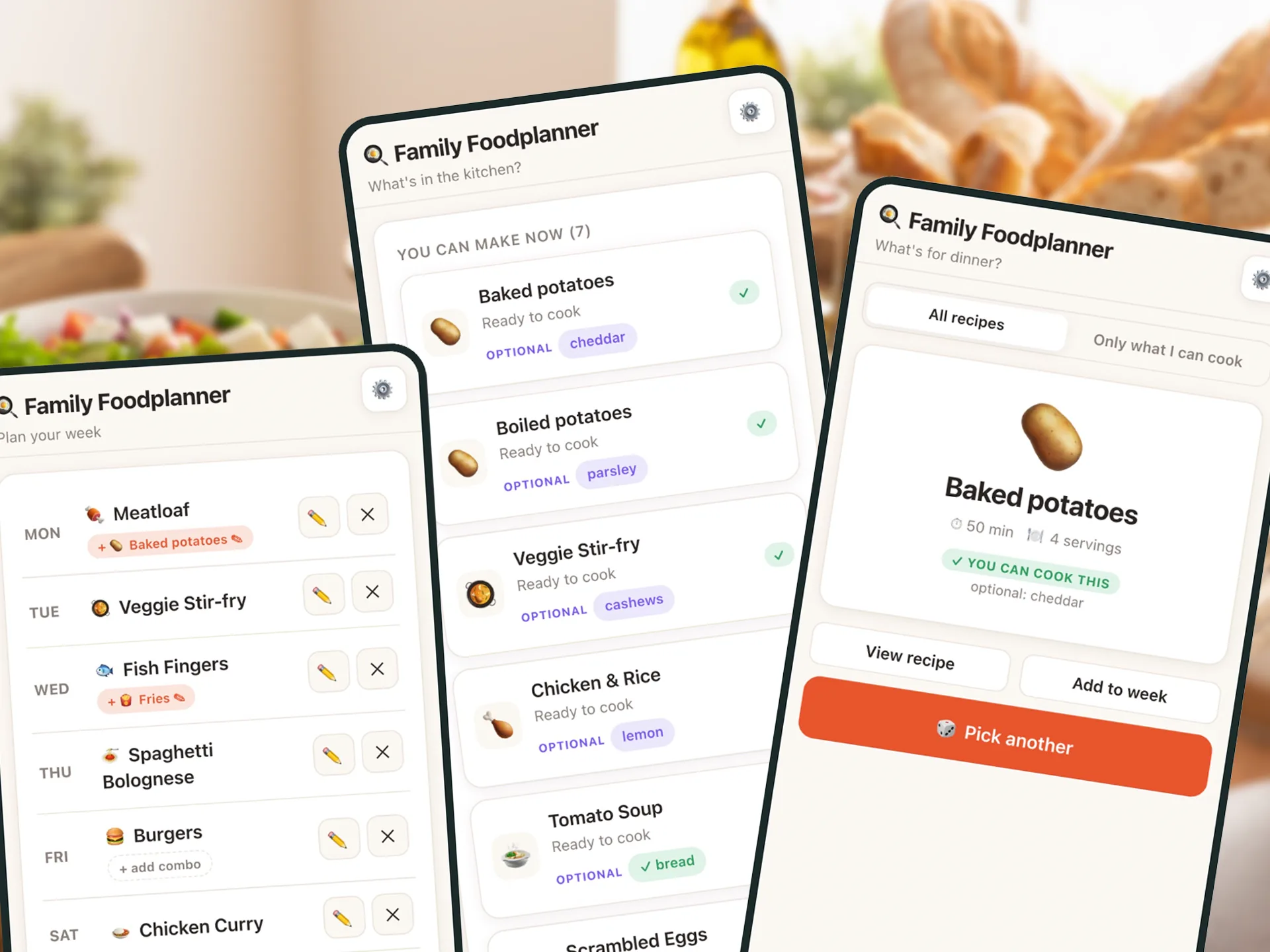
In our house, the hardest part of dinner is not cooking it. It is deciding what to eat, and who gets to choose. The recipes are there, the ingredients are mostly there, the energy to settle that every single evening is not.
It started as a single paragraph I wrote for myself: something I could share with my family to choose what to eat tonight, or plan a full week. It had to hold our recipes, have a random picker, and maybe track ingredients so it could suggest what we can make. Almost as an afterthought, I added that some ingredients should count as "general", so we would not have to tick salt and onion every time.
That one afterthought ended up shaping half the app.
This case study is about the decisions behind the app: what it should be, living with every version, and saying no when something felt off. That is where the design actually happened, so that is what the rest of this is about.
The feature was the easy part. The decision was the product.
Families do not plan meals in one way. Sometimes it is five o'clock and nobody has an idea. Sometimes it is Sunday and you want the week sorted. I gave each of those moments its own tab, named after the question it answers.
What are we eating tonight?TonightOne big button that picks for you. Optionally only from meals you can cook right now.
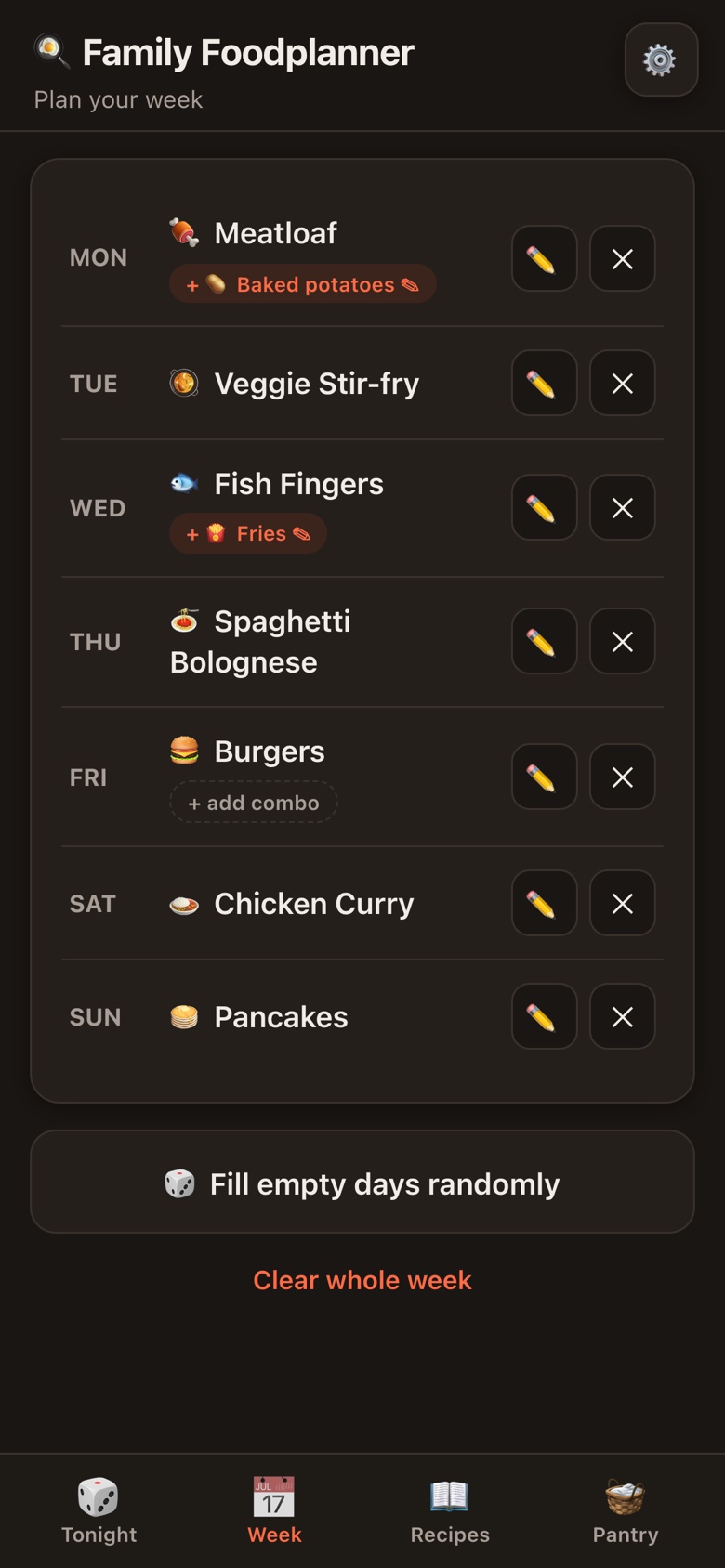
What are we eating this week?WeekSeven rows. Plan by hand, or fill the empty days in one tap.
How did we make that again?RecipesThe family cookbook, with ingredients, extras and what goes well together.
What can we make with what is here?PantryTick what you have. See what you can cook, and what is one item away.
The first real choice was about feel. Polished, colourful and photo-led, or phone-first and simple. I picked simple. Dinner gets decided standing in the kitchen with a phone in one hand, so big tap targets mattered more than beautiful cards. Recipes get an emoji instead of a photo: it costs nothing to add, and an empty photo slot nobody fills makes an app look broken.
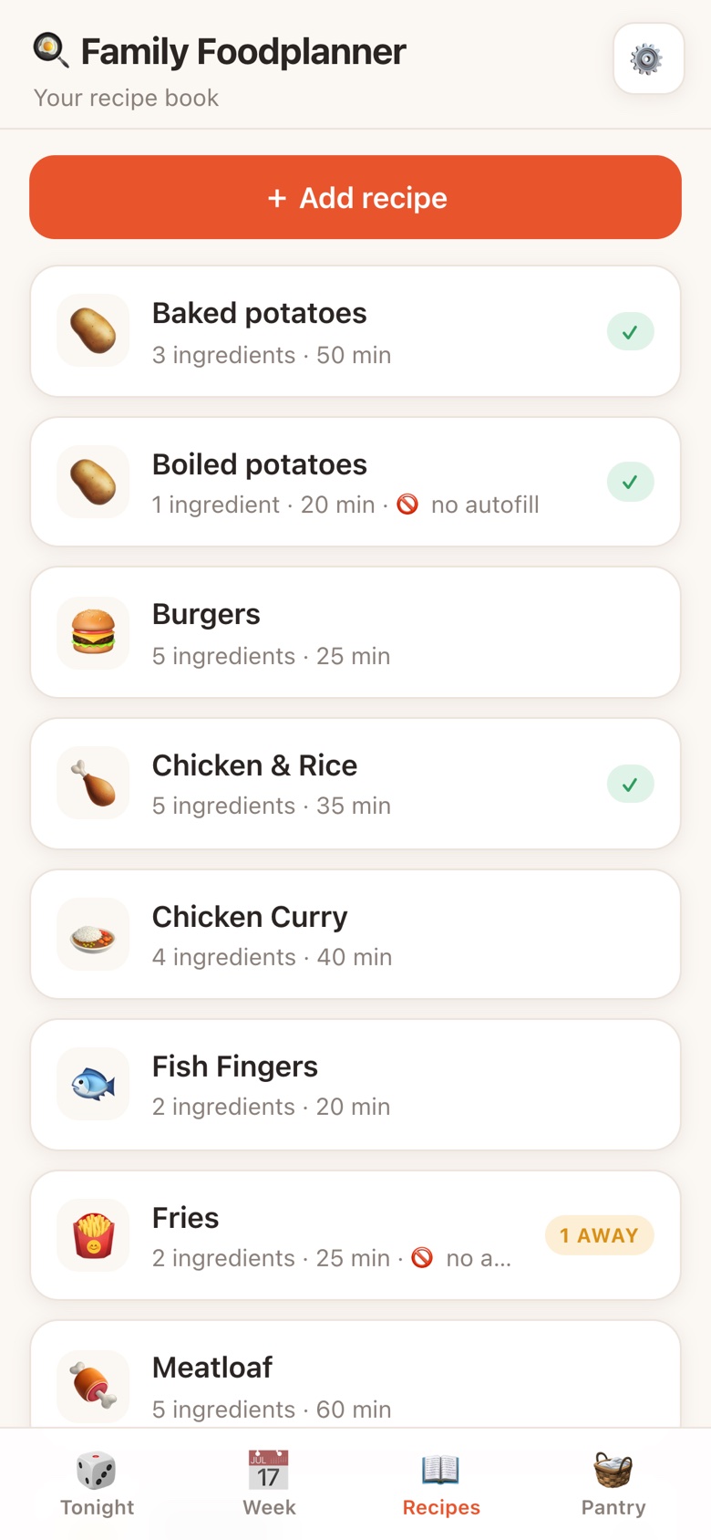
The app is named after a question most families ask every single day, so the Tonight tab answers it with one button. Tap it and you get a meal. Nothing to read, nothing to scroll, nothing to weigh up.
Under the button sits a single switch: pick from everything, or only from meals you can cook right now. That second mode leans on the pantry and the staples, so a tap never hands you a dinner you cannot actually make tonight.
And it never repeats itself. Pick another always skips the meal you just turned down. A picker that offers the same thing twice in a row feels broken, even when the maths says it is fine.
The whole app is one question. This tab is the one-tap answer.
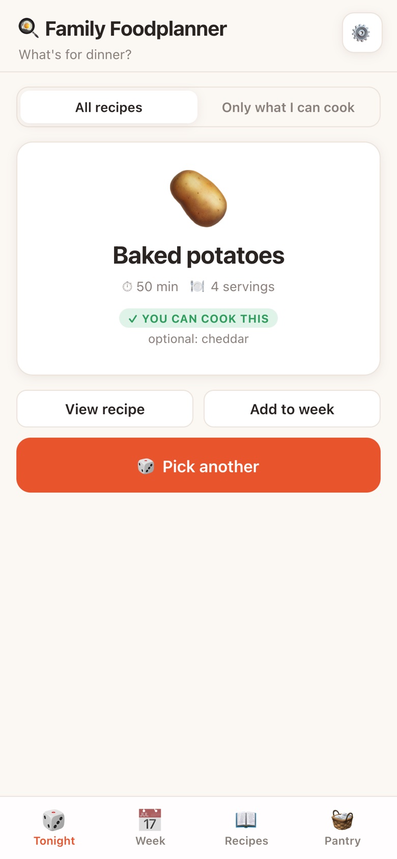
That "general" idea became the staples list: salt, pepper, oil, onion, garlic and a few more. Staples are assumed to be in the kitchen and ignored when the app works out what you can cook. Nobody ticks salt. The list is editable, because every kitchen's "always there" is different.
With staples out of the way, the pantry can say something useful. Not just what you can make now, but what you are one item away from. "Just need: minced beef" turns a vague trip to the shop into a single thing to buy.
Then I caught a mistake. The recipe book showed how many ingredients each recipe had, and it was counting the way the matching logic counts, without the staples. Spaghetti Bolognese has six ingredients, not four. Hiding the onion from the maths is right. Hiding it from the person reading the recipe is not.
What the logic ignores and what the screen shows are two separate decisions.
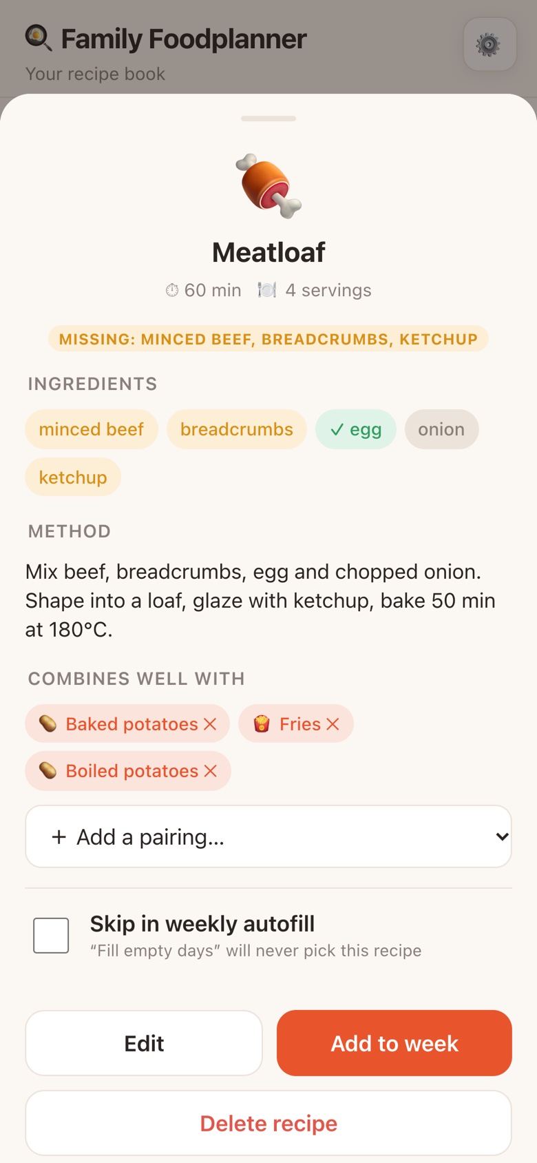
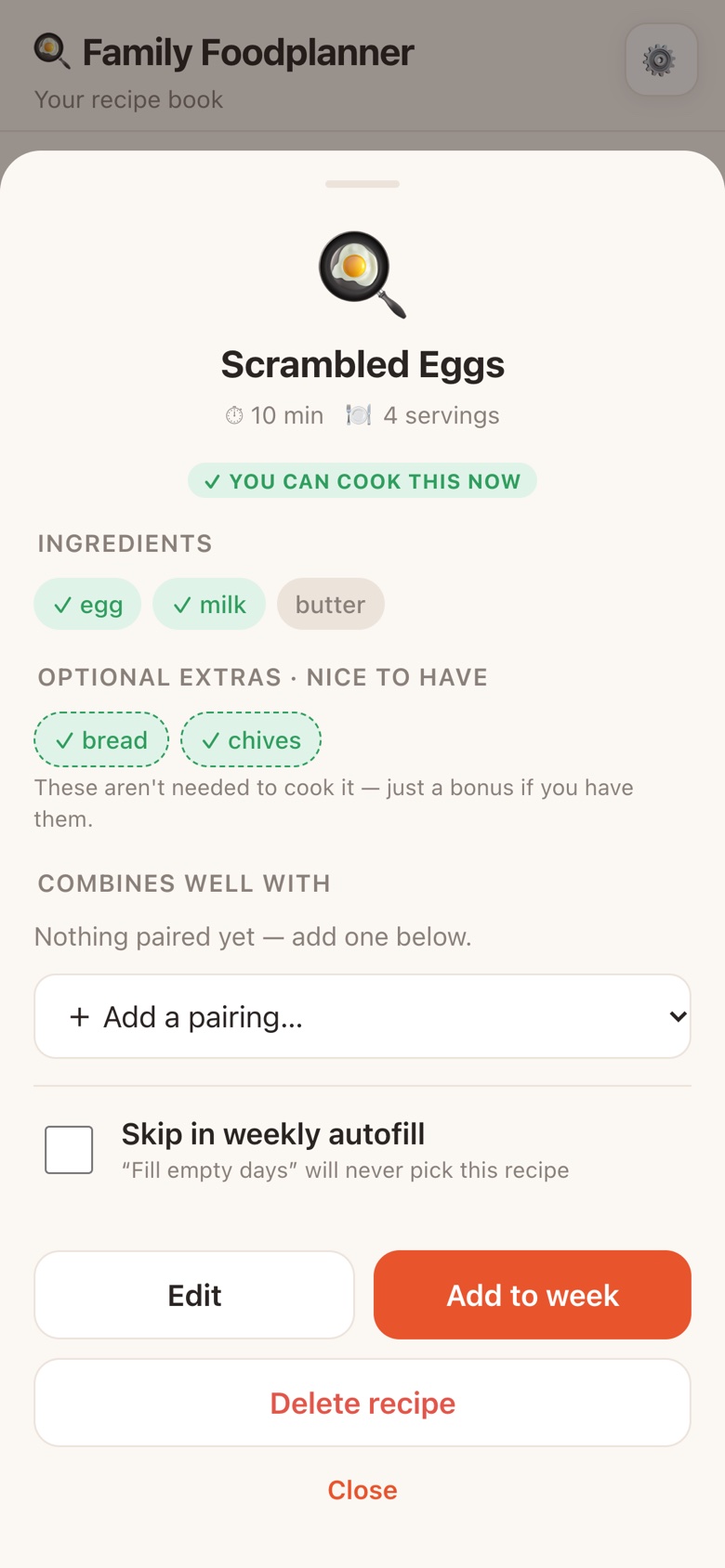
Scrambled eggs do not need bread. They are better with it. I wanted recipes to know the difference, so every recipe got a second field: optional extras. They never stop a meal from counting as cookable. They only tell you whether the bonus is there.
The interesting question was where to show them. The first build put an optional marker in the pantry checklist, and I took it out again. Bread is optional with eggs and essential for a sandwich. The pantry is a list of food, and food is not optional. Only the relationship between a recipe and an ingredient is.
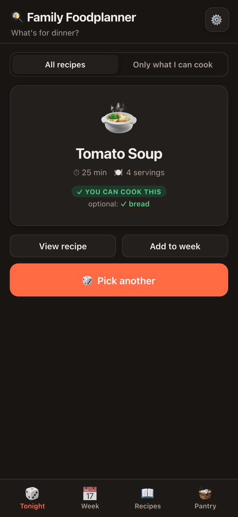
So the extras live with the meal. They show up where they matter: in the "you can make now" list, as purple pills that turn green when you have them. Once you know dinner is possible, the next question is whether you can make it a little nicer.
Where a label lives says what it means. Put it in the wrong place and it quietly lies.
The same kind of mix-up showed up in the pantry. I added an ingredient by hand, unticked it, and it disappeared. The app was treating "in stock" and "on the list" as one thing. They are two: the list of things our kitchen ever has, and the ones that are here today. Separating them made the checklist something you can trust from one week to the next.
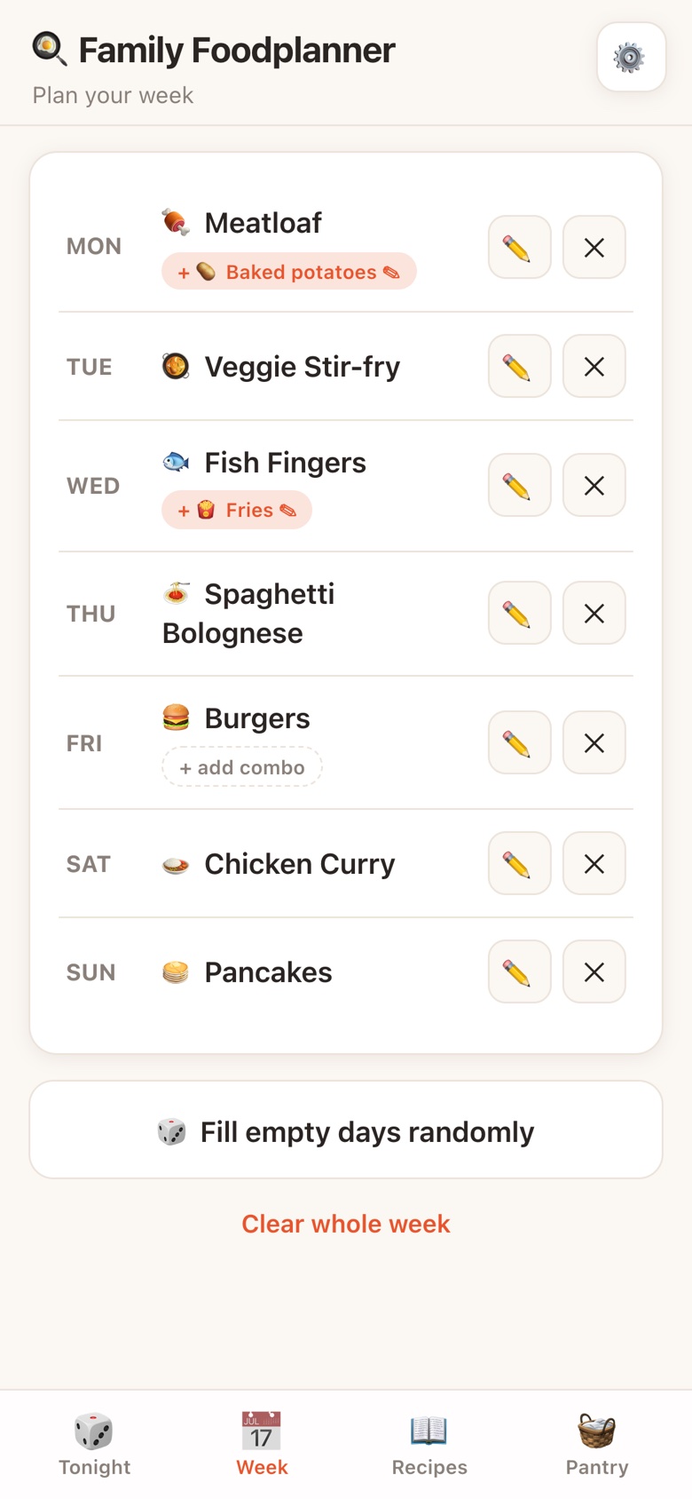
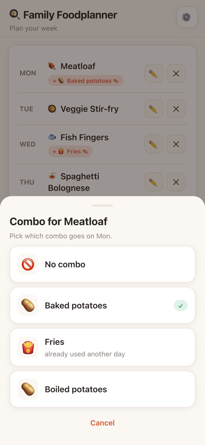
The week planner grew in three steps. Fill the empty days, but avoid doubles. Let recipes be marked as good together, like meatloaf with baked potatoes, and show the pairing as a small bubble on the day. And keep avoiding doubles, so meatloaf with baked potatoes on Monday means neither turns up again that week.
Then I tested it, and the week came back with meatloaf and baked potatoes on Monday, and meatloaf again on Friday, with fries and boiled potatoes both hanging off it. My question was whether I simply had too few recipes.
It was a real bug, and a useful one. The pairings were worked out every time the screen was drawn. They were never part of the plan itself, so the autofill could not reserve them. You cannot promise "no doubles" about something you are not storing.
| When… | Combo worked out on screen | Combo stored in the plan |
|---|---|---|
| A main has three pairings | All three bubbles show | One is picked at random |
| Meatloaf is Monday's combo | Still free for Friday | Taken for the whole week |
| You plan a day by hand | No way to choose the combo | Tap the bubble to swap or remove it |
| A paired recipe is deleted | Depends on what the screen finds | The combo is cleared, the day stays |
Main or combo, a recipe appears once a week. The role does not matter, the plate does.
Any recipe can be marked to skip autofill. Fries on their own are not dinner. Fries next to meatloaf are, so a skipped recipe can still be picked as a combo for one that is not skipped.
When you pick a combo by hand, one already used on another day is labelled, not hidden. The rules guide the random picks. The family still gets the last word.
If the plan does not store it, the plan cannot keep a promise about it.
"Share it with my family" sounds like a feature. It is really a decision about where the data lives, and it took longer to get right than anything on screen. This is the path it took.
The trade-offs were made on purpose. The PC has to be on. It only works on the home network, which is where dinner gets planned anyway. Anyone on that network can edit, which is fine for a family and would not be for anything else. Remote access and a simple passphrase are noted for later, not built before they are needed.
Sharing also changed how the app behaves. Every phone checks for changes every couple of seconds, but never while you are typing or have a sheet open, so a recipe does not rewrite itself under your thumb. Each phone keeps its own copy, so the app still opens when the PC is off. And some things are deliberately not shared: switching to dark mode changes your screen, not everyone's.
For a family app, the best login screen is the one that does not exist.
Most of these came from opening a new build, noticing something slightly off, and not letting it slide.
A pairing is a "combo", the word a family actually says at the table, not "side" or a tidier technical label. Interface copy should sound like the people using it.
Every ingredient is shown with a capital letter, but matched in lowercase. "Bread" and "bread" are the same loaf.
Nobody remembers where the emoji keyboard keeps its food. The emoji field links straight to an emoji search, and if you leave it empty, the app picks a food emoji for you.
The first dark build had an invisible button: the X to clear a day in the planner blended into the background. A theme is not done when the colours flip. It is done when every control still reads in both.
Removing a recipe also removes it from every pairing and from the week. Only that delete asks for confirmation. Clearing a single day does not.
The same lesson kept coming back. Building a feature was rarely the hard part. What took time and judgement was deciding what "optional" means, what "no doubles" includes, and where a family's recipes should live.
Most of those decisions started with a build that was almost right. An optional marker in the pantry, combos that were never reserved, a counter that skipped the onion. Each looked like a small interface tweak. Each turned out to be a question about the model underneath, and the fix was a better answer to that question, not a better button.
And the textbook answer is not always the right one. Cloud sync was the sensible recommendation. A zip file on a PC in the corner fits my family better, and it was my call to make.
What it set out to fix, it fixed. Nobody stands in the kitchen at six any more, deciding what is for dinner or who gets to call it. That question is settled in one tap, which leaves the evening for the part that was always worth it: the food.
The decision now takes one tap. What it gives back is time for better food.