Bone, not white
The light pages sit on a warm off-white, closer to paper than to a hospital corridor. It takes the clinical edge off without anyone quite noticing why.
Security brands usually come in two flavours: the cold blue bank vault, or the hacker in a hoodie lit by green code. Secure This needed a third option: a company you would trust with the keys to your building, and still actually want to call. Everything here grows out of one shield logo.
Security sells on fear, and it dresses the part. Navy and steel, padlocks, glowing circuit boards, a stock photo of someone in a hoodie hunched over a laptop. All of it says serious. It also says distant: the kind of company you hope you never have to call.
But look at what a client is actually buying. A hospital, a port or a bank lets a group of strangers into its systems, on purpose, and pays them to find every weak spot. That takes trust in people, not in padlocks.
So the brief had two halves that pull against each other. Look like the safest pair of hands in the room. Feel like people you would happily sit across the table from.
You don't hire a security firm. You hand someone your keys.
| The usual security brand | Secure This | |
|---|---|---|
| Colour | Navy, steel, cyber blue | Signal red, heavy black, warm bone |
| Imagery | Padlocks, hoodies, binary rain | The work itself: a live feed, real numbers |
| Voice | Fear and acronyms | Plain talk, with a named opponent |
| Proof | "Military-grade", "next-gen" | 11 minutes median containment, retest included |
| Shape | Sharp and cold, or round and soft | Chamfered: engineered, but careful |
A shield is the oldest trust signal there is. Everybody reads it in a split second, which is exactly why most security logos stop right there. I kept the shield and made it work harder: everything inside it spells the name.
 1
2
3
Three ideas in one mark
Nearly every security brand is blue. Blue is calm, corporate and safe, and by the fifth competitor it is also invisible. Secure This is red for a reason that comes straight from the trade: in security, the red team is the attacker, the people paid to break in so the real ones can't. This firm is a red team. The colour is the job description.
Red also does something blue never can. It is warm. It is the colour of a pulse, a signal light, someone awake on the night shift. Next to heavy black it reads as strength, on its own it reads as urgency, and together that is the whole personality.
SECURE in black, THIS in red, set heavy and condensed like a stencil on a crate. The name reads as an instruction: secure this. The red word points straight at whatever you are worried about. Two short words, nothing to decode.
With the logo carrying the meaning, the rest of the system was about temperature. Every choice had to add trust without adding chill, and every one of them comes out of the mark rather than a moodboard.
Every button, card and panel has its corners cut at an angle, borrowed from the angles in the shield. It is the detail that ties the whole system to the logo: one button on its own, with no logo anywhere near it, still looks like Secure This instead of a template with some red poured in.
Rounding the corners would have been the easy way to look friendly, but it would also have made the brand soft, and nobody wants the people guarding their building to look cuddly. The cut corner keeps the hard, straight edge of the shield, and it is clearly a shape somebody chose, not a default.
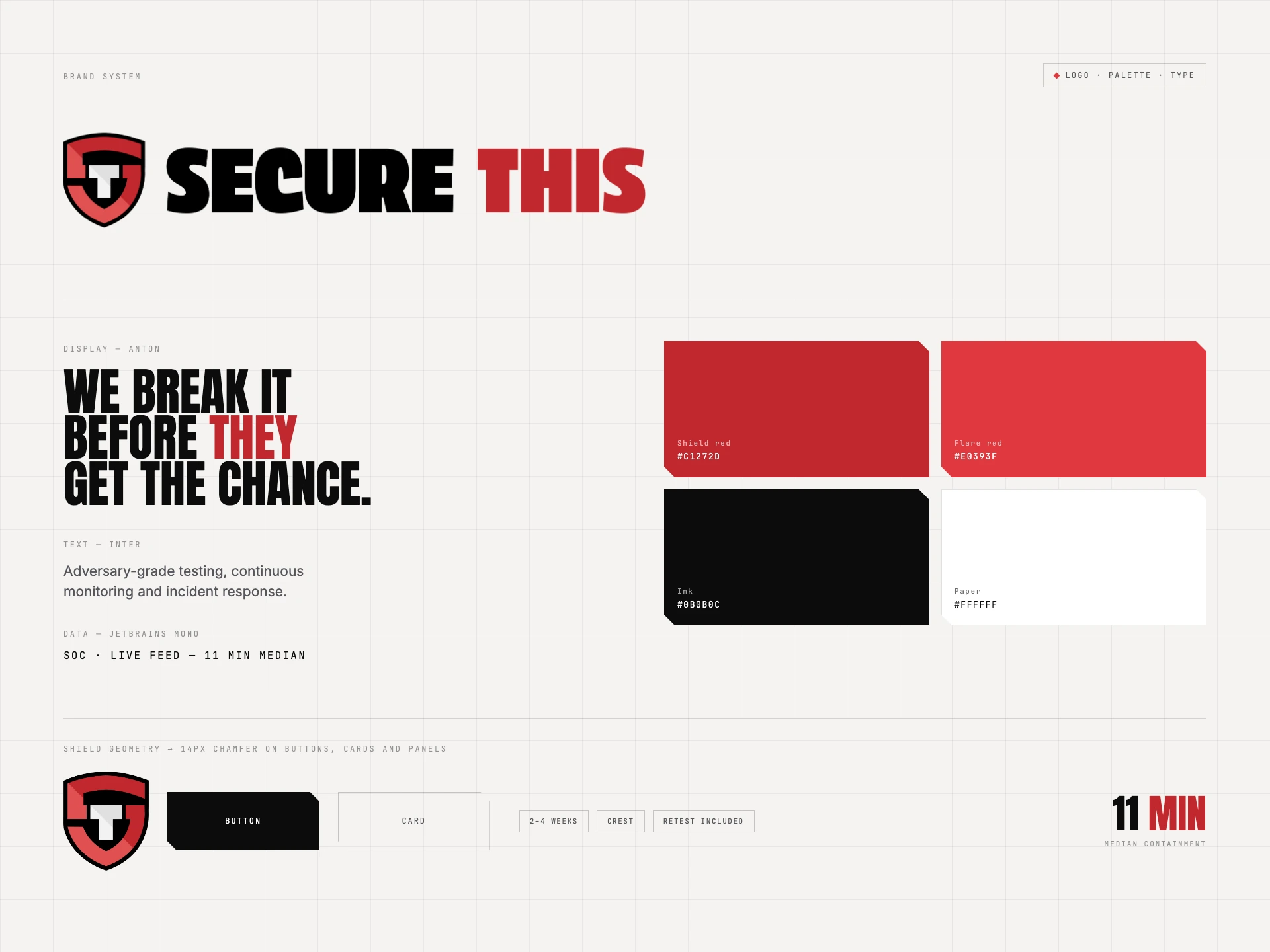
The whole system on one sheet. The mark, the palette, three typefaces and the chamfer, all pulled out of the logo.
The light pages sit on a warm off-white, closer to paper than to a hospital corridor. It takes the clinical edge off without anyone quite noticing why.
A deep shield red carries weight in print and big blocks. A brighter flare red handles links, labels and anything on a dark screen, where the deep one would sink.
Anton for headlines, as close as an open font gets to the wordmark. Inter for reading, calm and plain. JetBrains Mono for data, so figures and timestamps look like receipts.
Every security firm says it can be trusted, so the site never says it. It shows the work and leaves the trusting to the visitor. Five pages, and on each one the same rule: if it can be shown or counted, don't describe it.
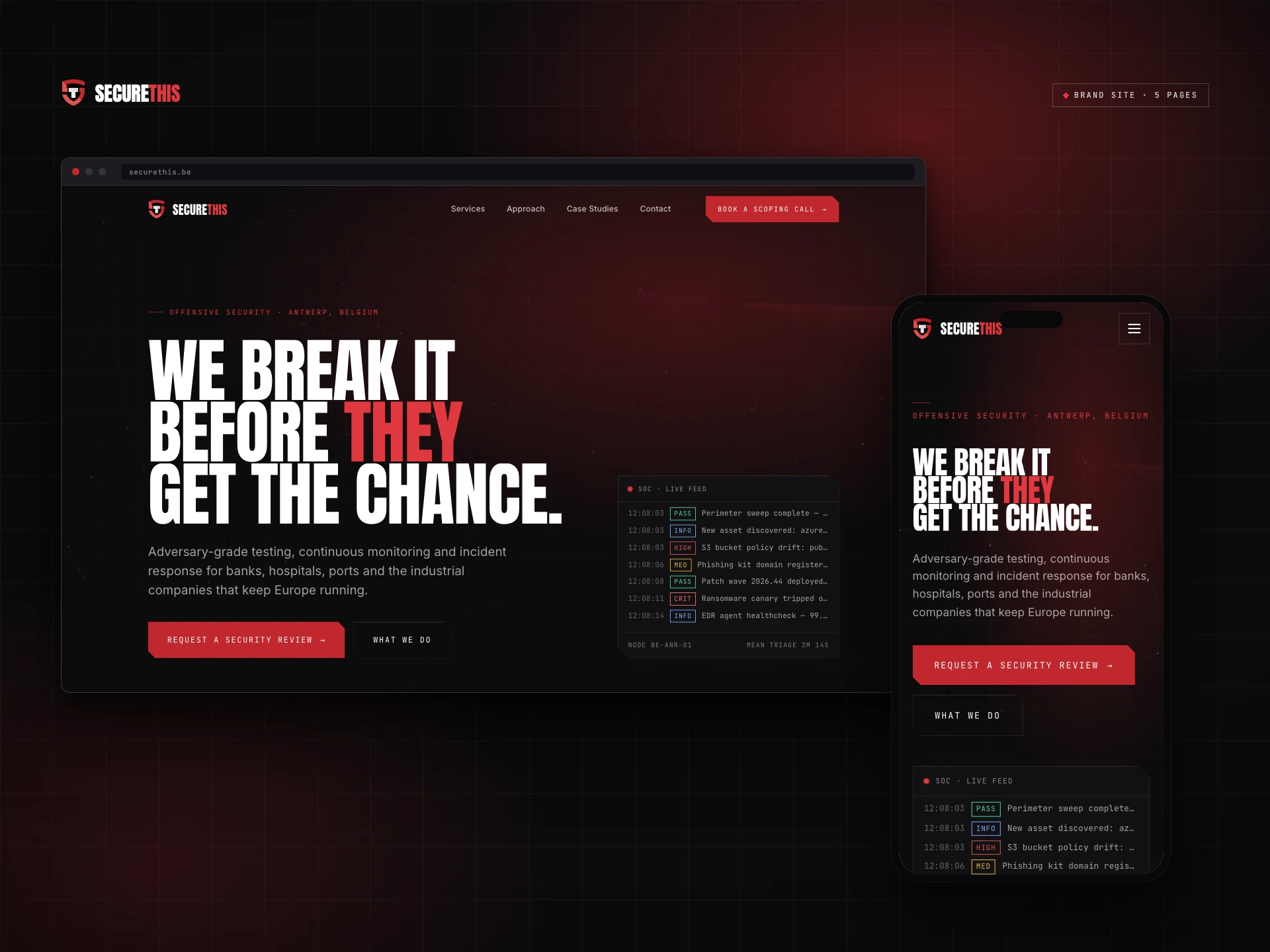
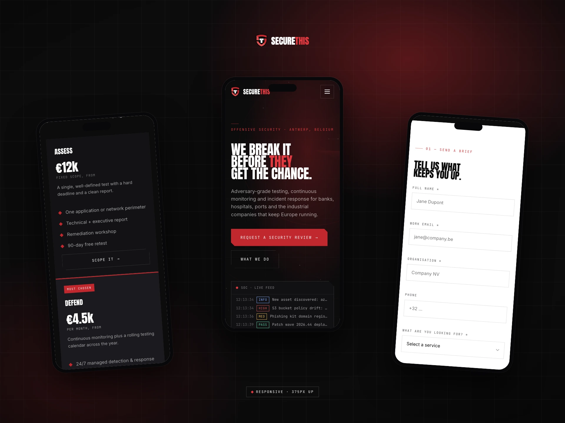
The home page opens with We break it before THEY get the chance, with THEY in red. One coloured word puts an opponent in the room and Secure This firmly on your side of the table. Confident, a little cheeky, and not a single acronym.
Where most security sites put a padlock or a hooded figure, this one runs a live feed from the security operations centre: timestamped events ticking past, tagged PASS, HIGH or CRIT. It turns an invisible service into something you can watch happening.
No military-grade, no next-gen. The pages deal in specifics: two to six weeks per test, a free retest within 90 days, an NDA before the first call, and prices right there on the page. The section titles say it outright: No theatre. Just the work.
The site lives mostly in the dark, like a monitoring room on the night shift, but the glow behind it is red instead of the usual screen blue, and the light sections sit on bone. The copy does the rest. The emergency line promises that a responder picks up, not a ticket queue.
A screen recording of the real site, not a motion mock-up. The headline rise, the node mesh, the live feed and the scroll reveals are the site's own code running.
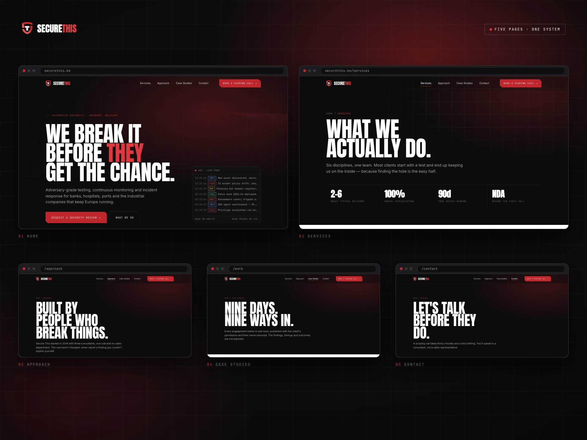
Five pages, one system: home, services, approach, case studies and contact.
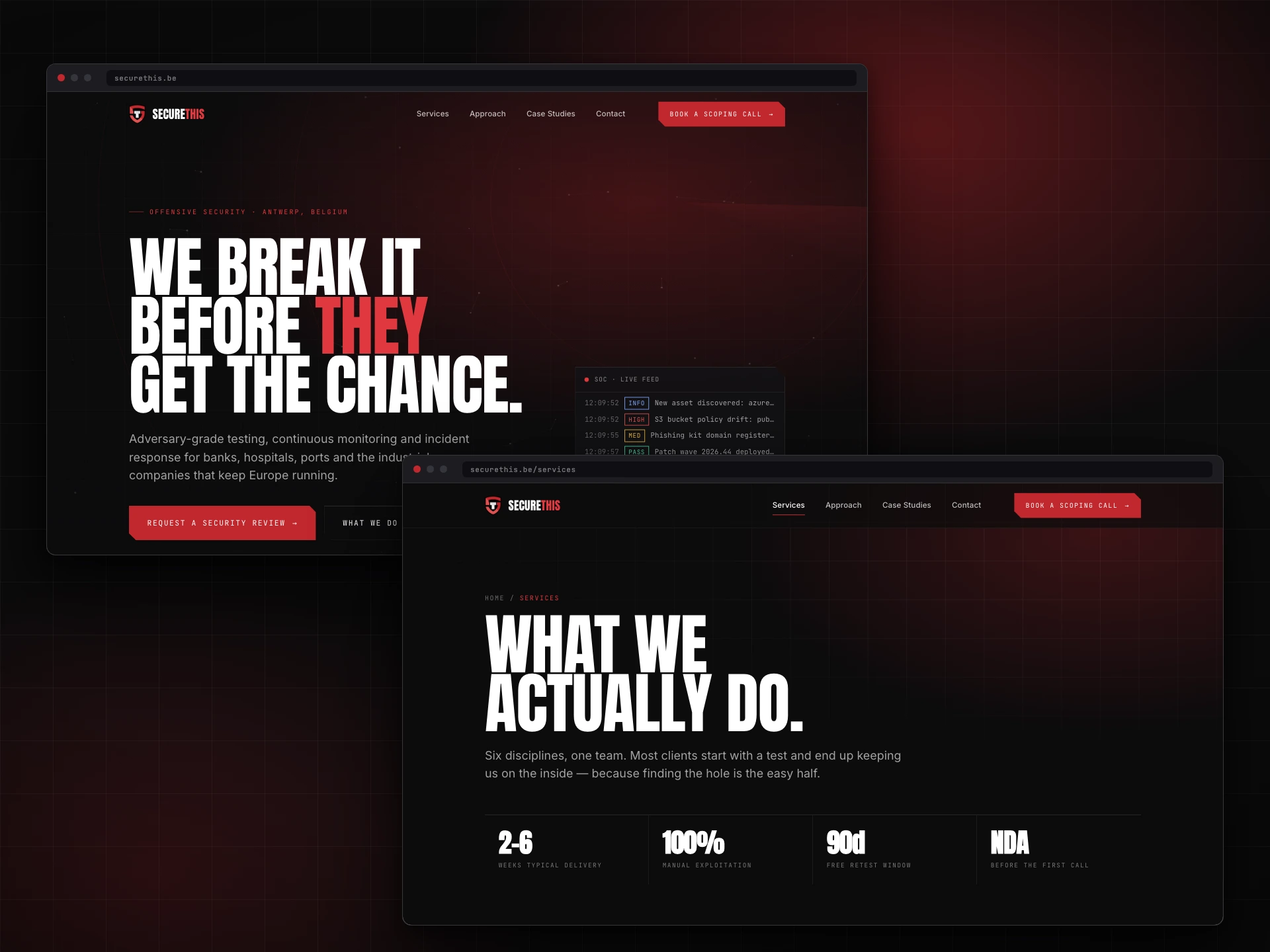
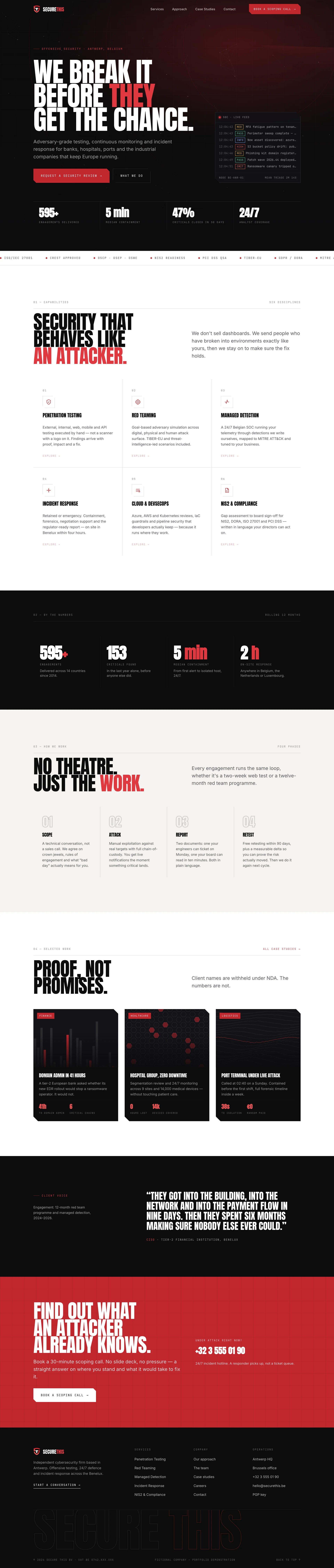
The full home page, top to bottom. Scroll inside the window.
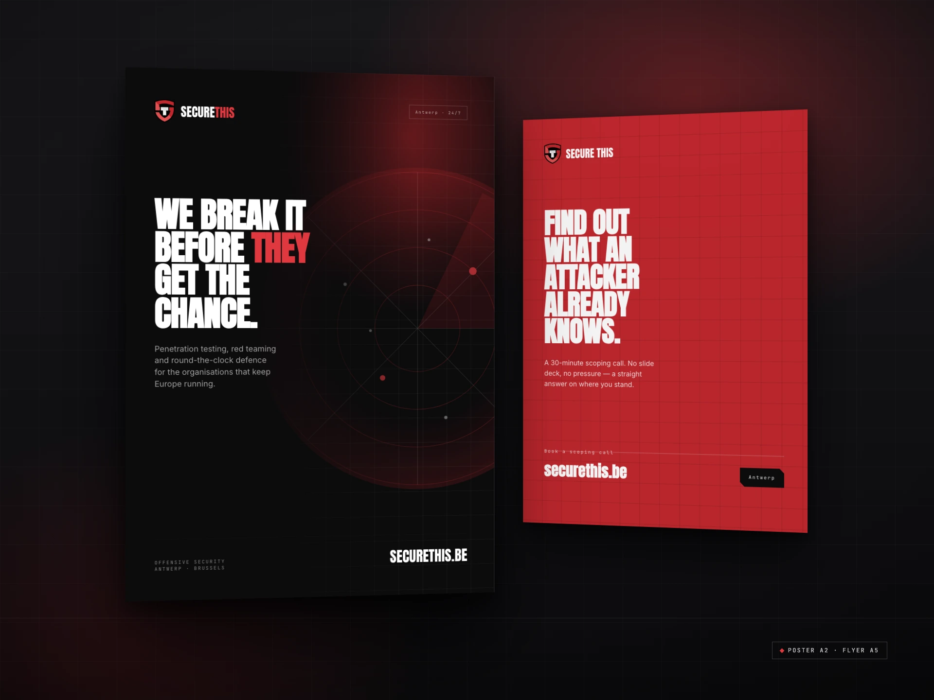
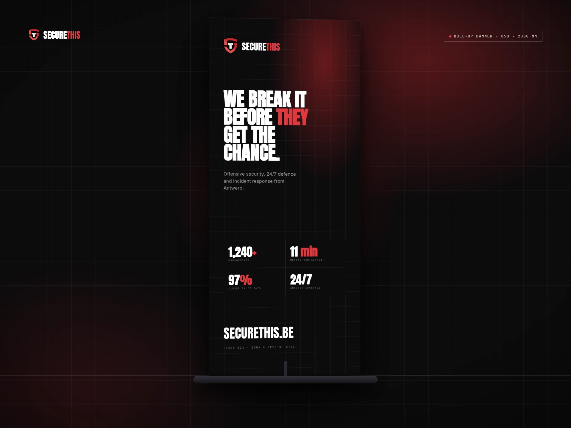
Trust grows when a brand looks the same everywhere you meet it. So the print kit follows the screen rules exactly: the chamfered tab, the mono labels, the bone paper, and red used sparingly and always on purpose.
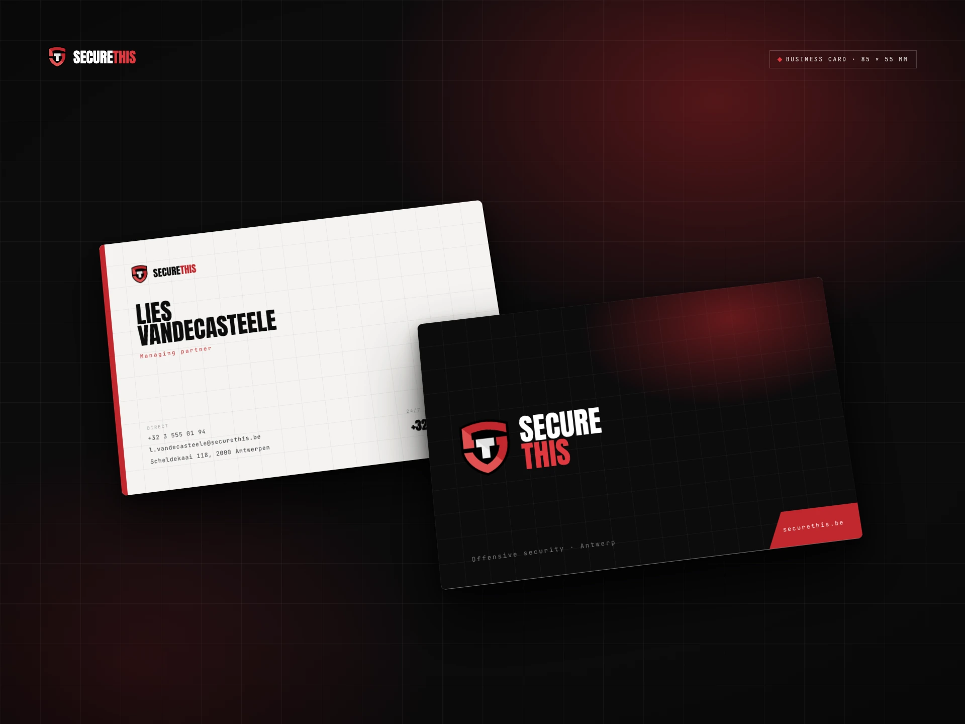
The headlines carry over too. The poster leads with the home page line, the flyer asks you to find out what an attacker already knows, and its back turns six services into six ways to stay ahead of them. Even the business card gets a red corner tab, cut at the same angle as every button on the site.
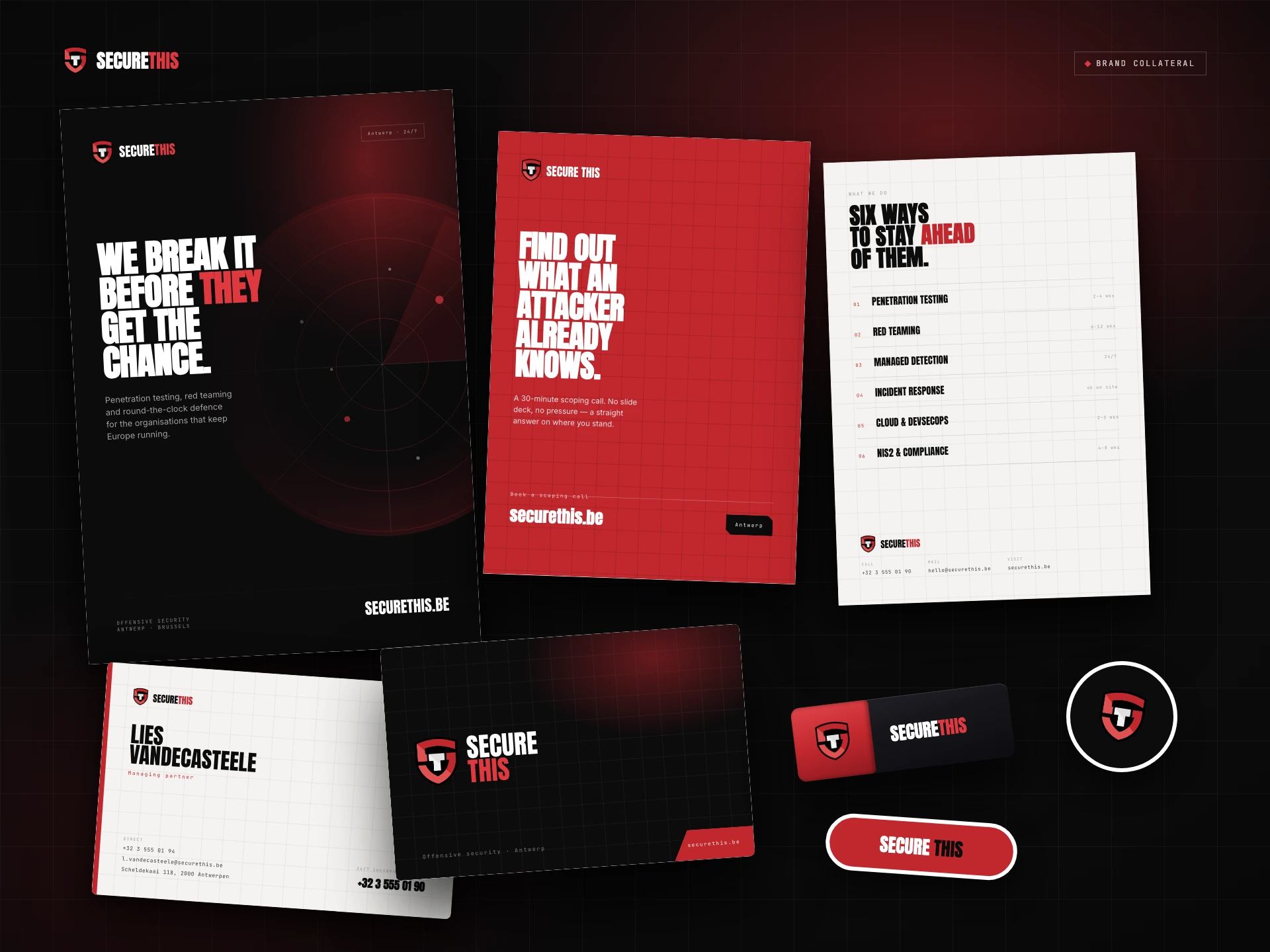
The full kit: poster, flyer, business cards, USB key and stickers.
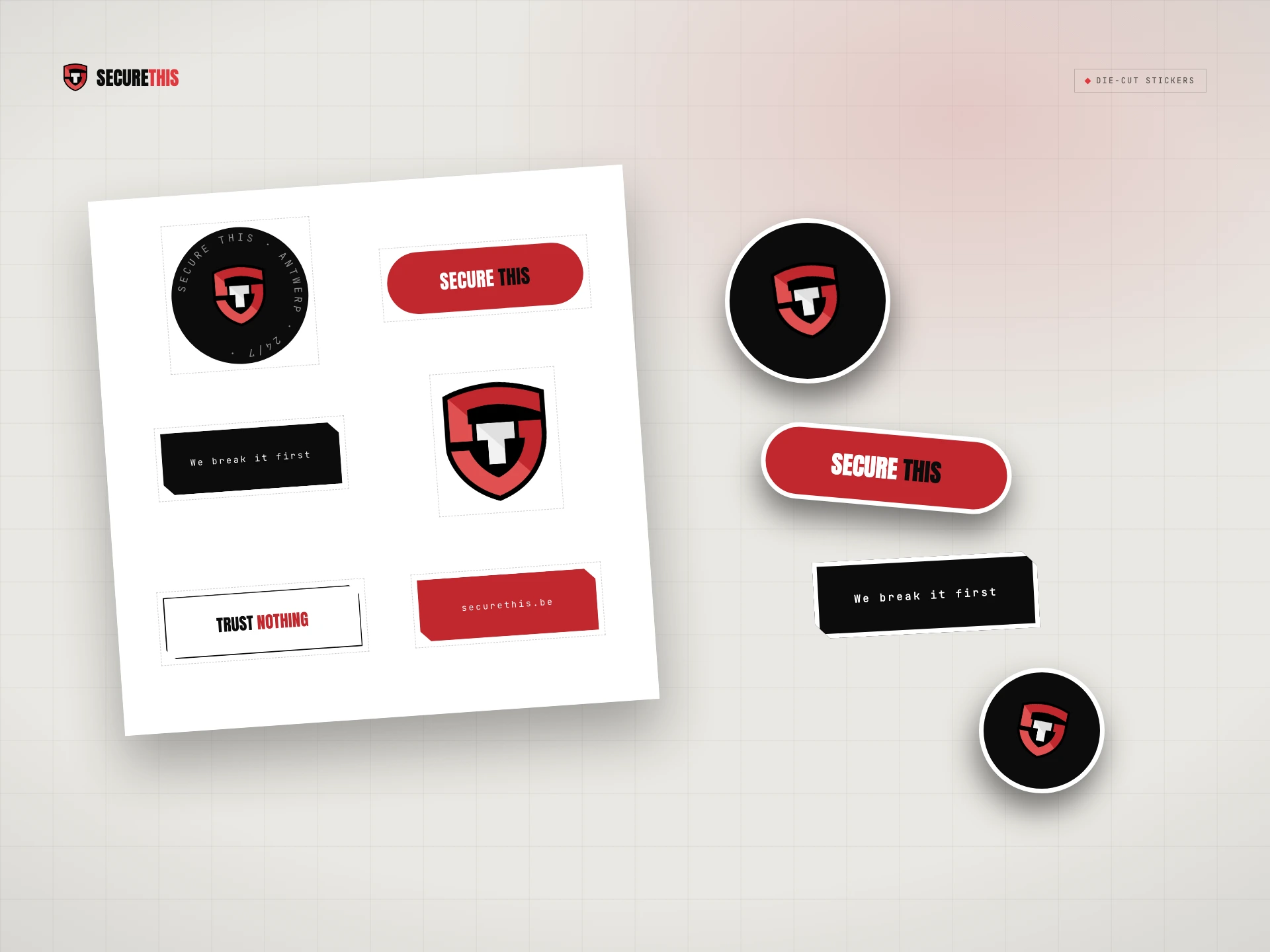
Security firms love handing out USB sticks at trade fairs. It is also the oldest trick in the book: drop a drive in a car park and wait for someone curious to plug it in. So a security company's giveaway has to be unmistakably its own.
The Secure This drive is the shield itself. Its outline is not redrawn by eye but traced straight from the logo artwork and turned into a 58 mm graphite body, with the mark printed on the face and the plug standing up out of the top edge. Change the logo and the drive follows.
Nobody should plug in a stranger's stick. Nobody will mistake this one.
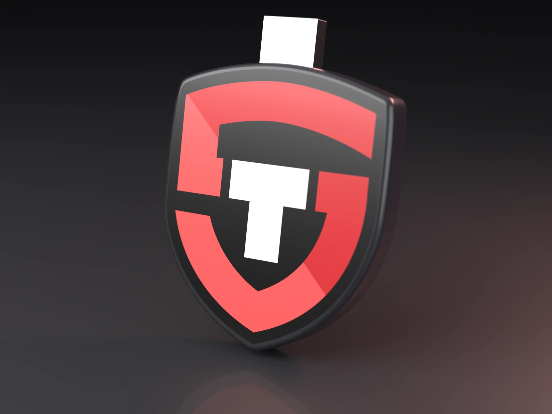
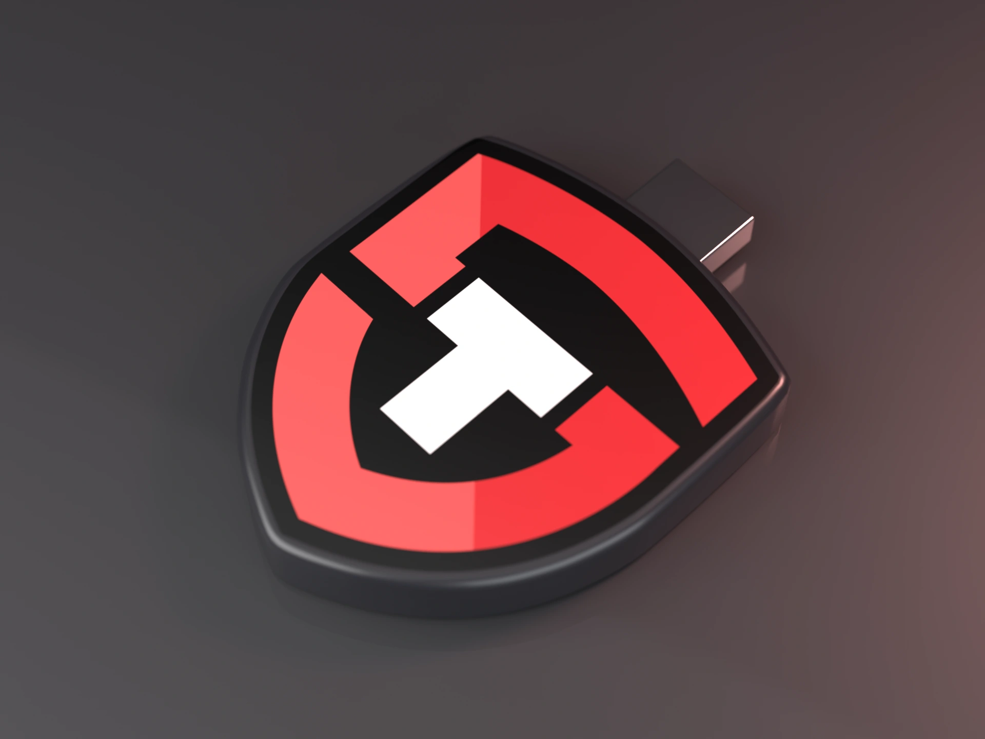
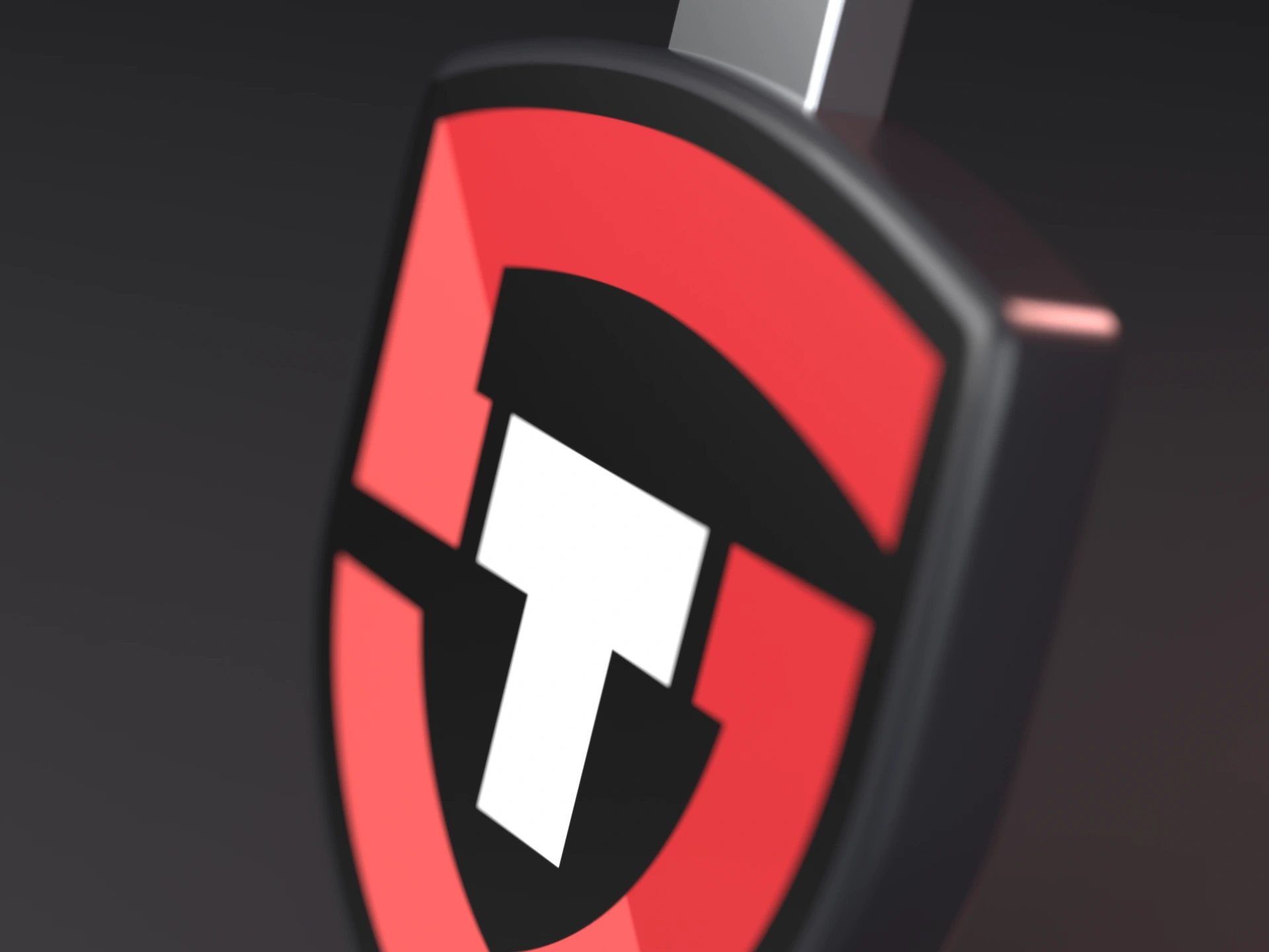
Up close: a rounded graphite rim, the printed mark and a real-size USB plug. Rendered in 3D with studio lighting.
Safe and boring are not the same thing, and neither are warm and soft. What made it work was giving every part of the brand one job. The shield and the black say strong. The red, the bone paper and the voice say human. The numbers, the live feed and the mono labels say honest. Together they make a company that looks hard to break into and easy to talk to.
It also showed me how far one mark can go when every shape in it has a reason. A shield, an S and a T turned out to be enough to fill a website, a print run and a product.
People don't trust shields. They trust whoever is holding one.