Colour means type
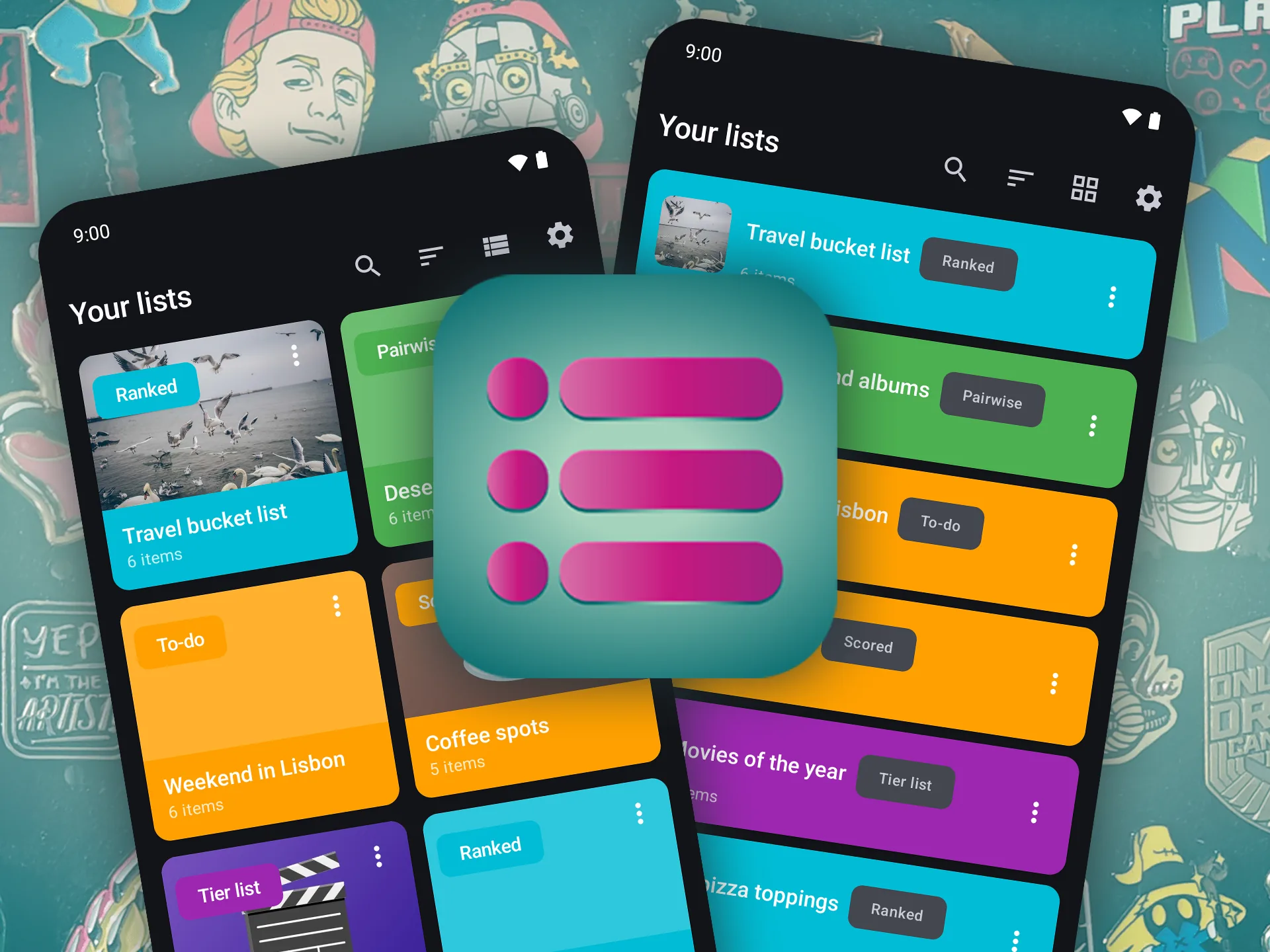
Each list type owns a colour, used on its badge, card, picker chip and widget. You read the type before the name. The colours are customisable, the rule is not.
How I designed and built VieListr, an Android app built on one idea: one list does not fit all. Five list types, each with its own way to rank and organise, and the interface decisions behind them. My own pin collection was just the first thing I threw at it.
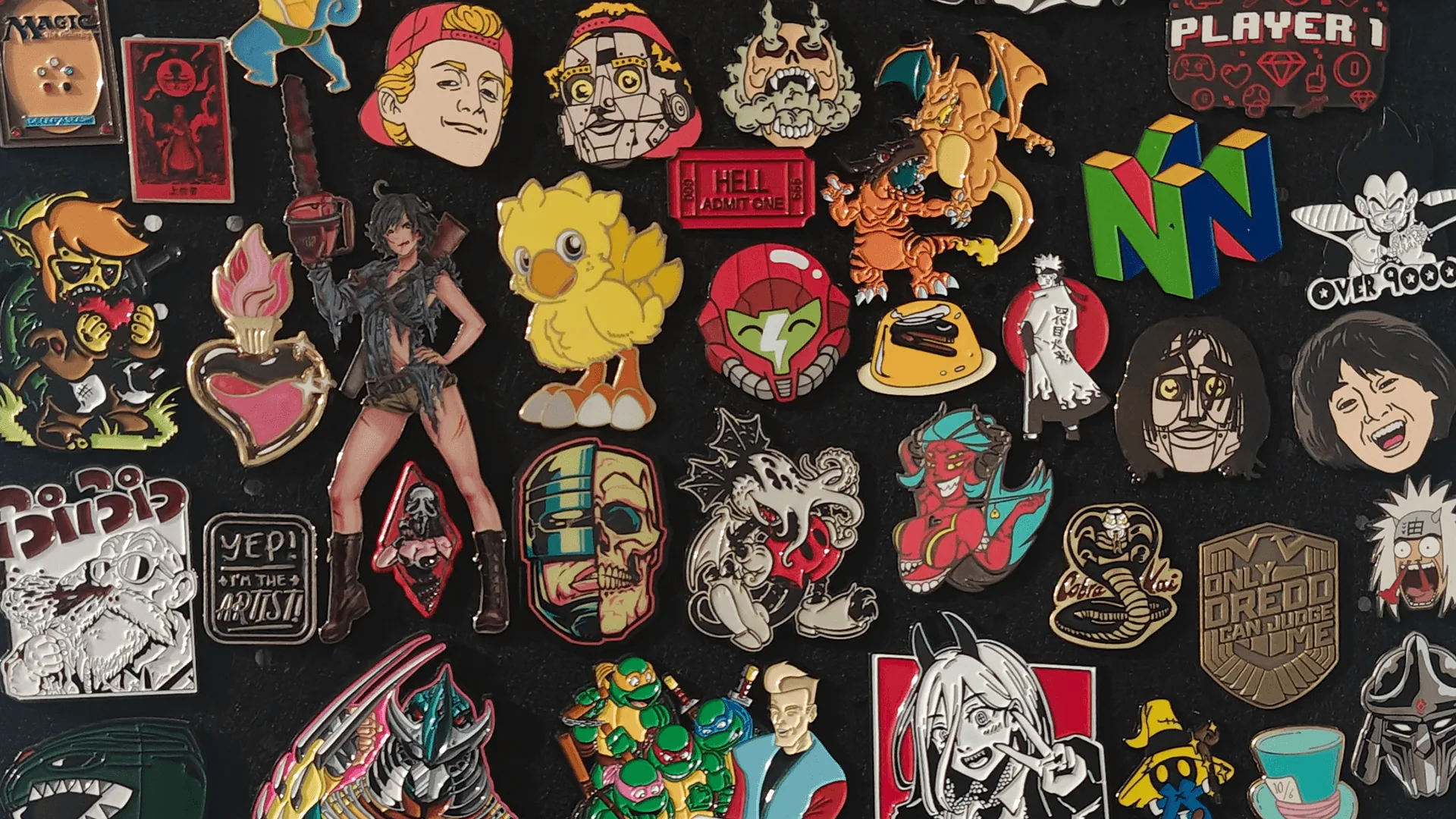
I make lists for everything: films to watch, gear to buy, soda flavours sorted by yum level. The one that finally pushed me to build my own app was a box of enamel pins I kept buying twice, because my only real overview was my memory.
A pin is the ideal list item. It needs no title or description, you just need to see it, so the photo list app I already used should have been perfect. It failed in two ways, and both were about design, not features.
The first was friction. Getting one item in took six steps:
Fine once. Not for a whole collection, which is exactly when a list earns its keep.
The second was worse. Photos I had added over the years were quietly turning into grey boxes. The app had only ever stored a link to each picture in my gallery, so clearing the camera roll or changing phones left the link pointing at nothing.
I did not need a better way to sort. I needed a faster way to capture, a list that would not forget, and the right kind of list for each job.
Pins are just one use. The app itself started from a simple observation: people make lists to answer different kinds of questions, and each question deserves its own interaction.

What is my order of preference?RankedDrag into place. Position is the ranking.

Roughly how good is each one?Tier listS to F rows. Buckets, not exact places.

What would I give it out of ten?ScoredRate each item. The list sorts itself.

I honestly cannot choose.PairwisePick the better of two, again and again. Elo builds the ranking.

What still needs doing?To-doCheckboxes and reminders. Not an opinion at all.
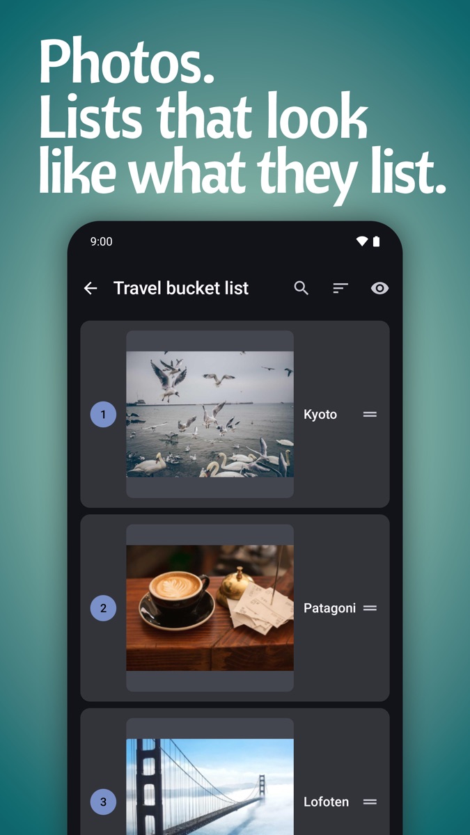
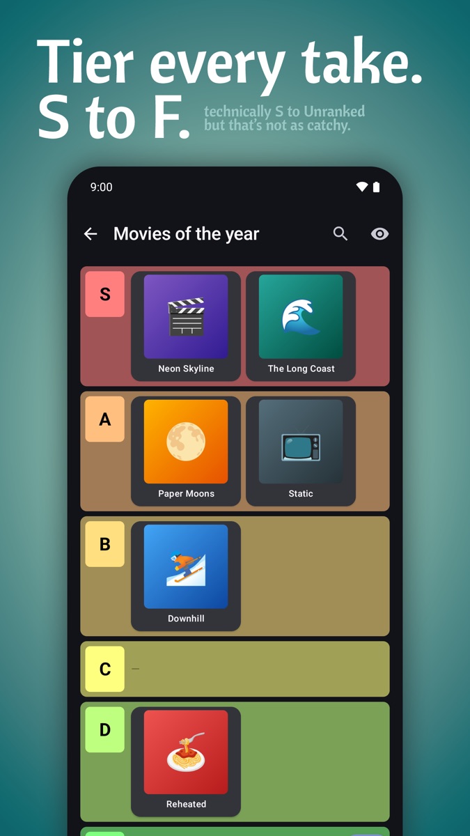
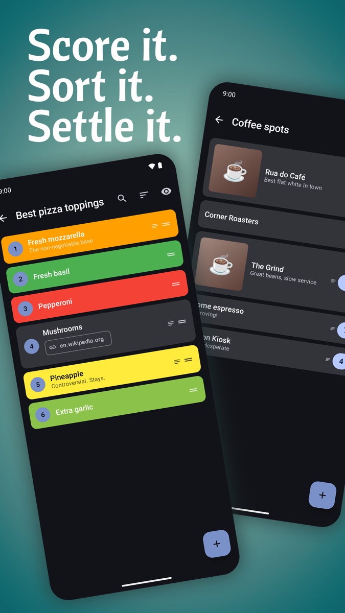
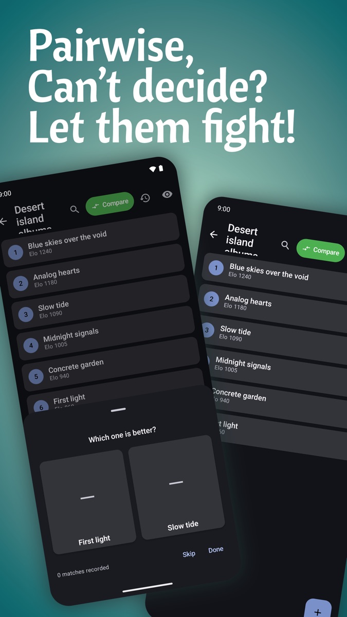
Photo batch opens a camera inside the app that stays open between shots. Every tap of the shutter becomes an item. You work your way along the table, one pin, one tap, and never leave the screen.
The whole screen is designed around the rhythm of that moment: eyes on the pin, thumb on the shutter.
What happens to the photos is just as deliberate. They go straight into the app and never touch the gallery, so a session of pins does not bury your holiday photos. Each shot is resized and compressed on the way in, to roughly 120 to 300 KB. A fifty-pin session takes up somewhere between 6 and 15 MB.
Capture is one job, organising is another. The camera should never wait for the app.
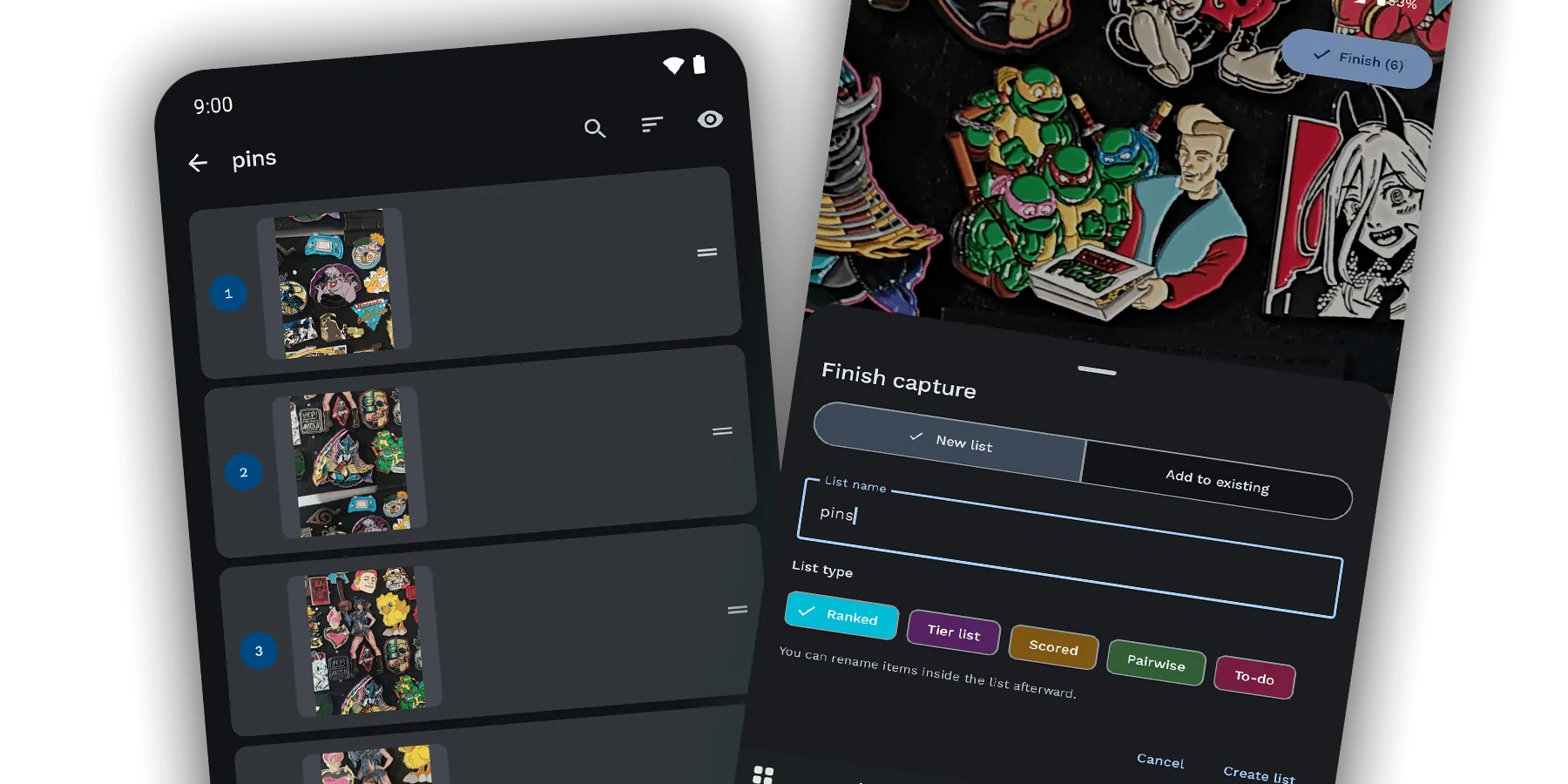
Most apps ask what kind of list you want before you have added anything. Batch flips that around. You shoot first, tap Finish, and only then choose, when you can see what you actually collected.
The Finish sheet offers two paths: make a new list and pick its type, or add everything to a list that already exists. That second option is what makes it work for a collection. After the next shopping spree, the new pins go straight into the list I already have.
It was tempting to ship photo batch as its own list type. I kept it as a way of creating items instead. The pin list that comes out is an ordinary list, and can do everything any other list can.
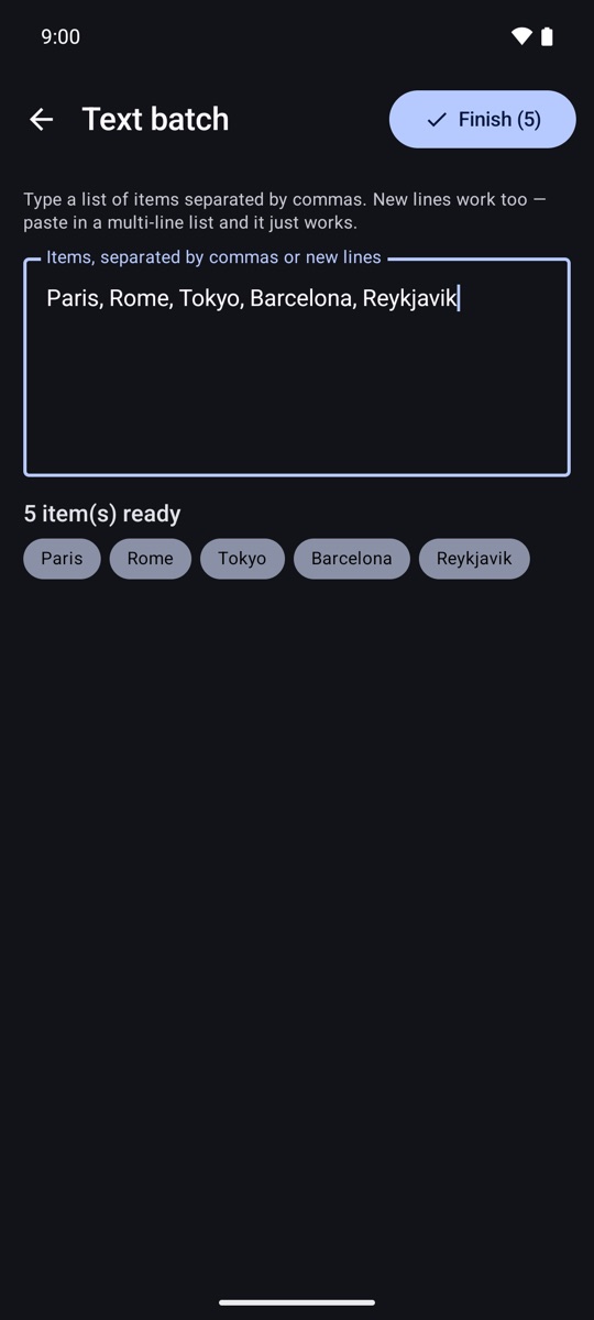
Later I added text batch, the same idea without a camera. Paste a list separated by commas or new lines and every entry becomes an item, ending on that same Finish step.
Because names are optional, the list was usable the second I tapped Finish. For a pin collection, the photo is the item. I switched it to large photos and had the overview I had wanted for years.
From there it grows at whatever pace suits me. The special ones get a name or a note. Favourites get dragged to the top. And because any list can be converted into another type, the whole collection can become a tier list the day I want to settle which ones are S tier.
The grey boxes in my old app came down to one decision nobody ever sees: storing a link to a photo instead of the photo itself.
VieListr copies every image into its own storage, whether it comes from the batch camera, the gallery or the desktop editor. That sounds like an engineering detail. For a memory tool, it is the product. Here is what it changes in practice.
| When you… | Photo linked | Photo copied |
|---|---|---|
| Clear out your camera roll | Grey box | Still there |
| Move to a new phone | Links point nowhere | One export file brings every photo along |
| Duplicate a list | Both share the same file | Each copy owns its own photos |
| Delete the item the cover came from | Cover disappears | Cover stays |
The same thinking runs through the rest of the app. There is no account and no cloud. Your lists stay on your phone, and even the desktop editor I built for typing long lists on a real keyboard only works on your own WiFi.
What people feel as trust gets decided in the data model, long before anyone draws a button.
I used every build of the app daily. Most of these came from catching a small annoyance and refusing to get used to it.
Each list type owns a colour, used on its badge, card, picker chip and widget. You read the type before the name. The colours are customisable, the rule is not.
Let people pick any colour and someone picks yellow. Text on badges and tinted rows works out light or dark from the background, so it always stays readable.
Filter by colour only appears once a list has coloured items, and only offers the colours in use. A control that does nothing is still something to read.
Pairwise first matched random items, so you got asked whether your favourite album beats your least favourite. Now it picks an opponent from the few items closest in score, so every question is one you actually have to think about.
Scoring once hid its slider behind an Add rating button. One tap too many for something you do dozens of times, so the slider is simply always there.
Swiping away an item is direct, and confirming can be turned off. Deleting a whole list from a menu, one step away from the list itself, always asks.
Drag an item onto another row, or tap it and pick a tier from a sheet. Dragging is satisfying. With a thumb on a crowded list, the sheet is faster.
On some phones the modern widget sat on a placeholder for minutes. I rebuilt it on the older system. A widget that shows your list straight away beats a modern one that does not.
Search from the home screen looks inside every list at once and highlights the match, so you find the item even when you have forgotten which list it lives in.
Designing the whole product myself, from where a photo is stored to the colour of a chip, made two things very clear.
Capturing and organising are different moments, and they deserve different designs. When you are standing at a table full of pins, the app should get out of the way. The decisions can wait until you are on the couch.
And the promises an interface makes are only as good as the system underneath. No amount of polish would have fixed those grey boxes. The fix was a decision about data, made with the user in mind.
Good UX is often invisible. In this app, the most important part of it is a copy of a photo.